Motion Design trailer for the Authored App
Project Overview: Animated explainer video for Authored: an app designed to make journalist's lives a little easier when publishing stories.
Client: Authored
Categories:
About the project
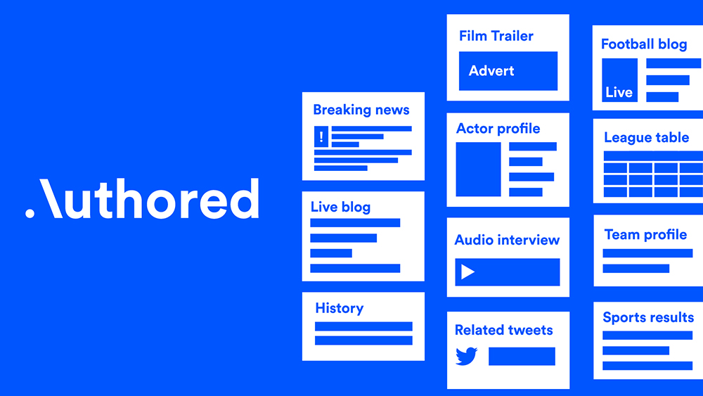
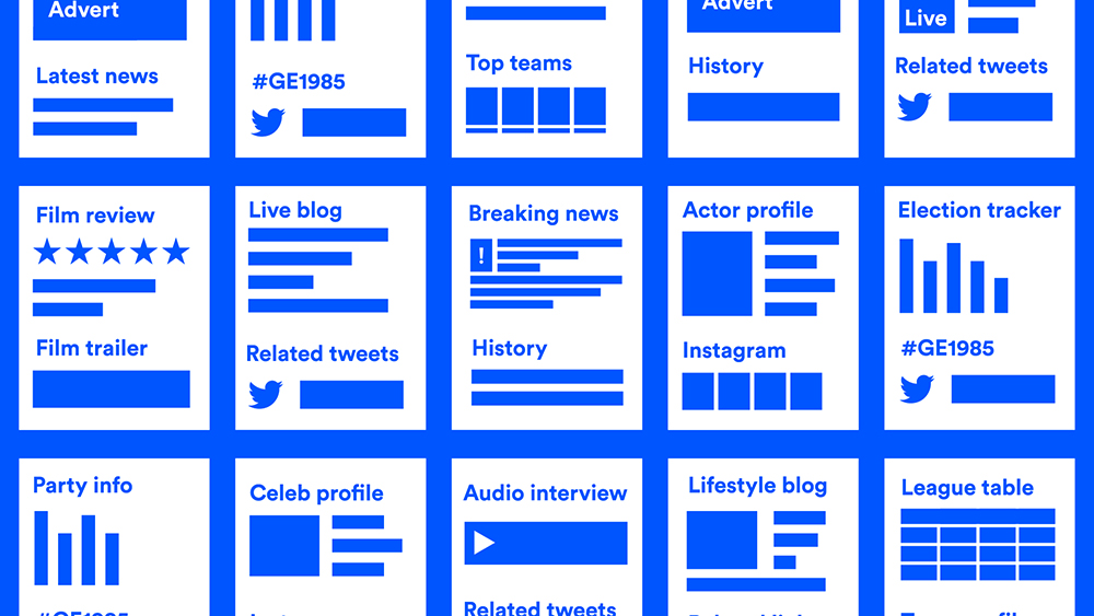
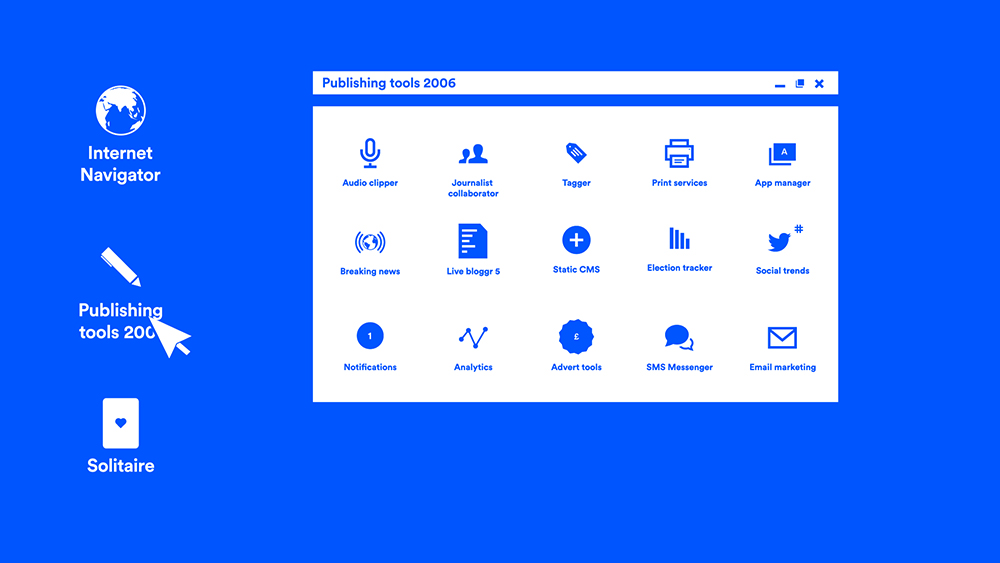
Looking at the Authored brand, the two core colours were a striking blue offset against pure white. With such a great contrast, I decided to style the whole animation just using these two colours. A throwback, perhaps, to old newspapers being in only black and white.
The client was really happy with the combination of kinetic text, illustrations, and seamless transitions throughout. All in all creating an animation that flows really well from start to finish.
I also provided the voiceover for this project, a service I now offer all clients as part of the motion design process.


Interested in creating an animation?
With more and more people watching videos online, animation and motion design are a great way to get noticed and spread your ideas to the world.
Don't worry if you're not sure where to start, send me an email using the button below and let's have a chat about how I can help.
Get in touch Book a call