The new twitter design
Twitter has today launched a major new design of their apps across the board.
Interestingly the announcement on http://fly.twitter.com came with a call to download the official mobile apps in order to get access to the new design on your computer, was this to reinforce a mobile first approach?
Perhaps it was just a ploy to get people back into using the official twitter app? Either way, I updated the iOS app & hey presto! The new web design appeared almost instantly.
I think one of the key things about the new design, for me, is that the design is now consistent across all the platforms. Personally, I always felt the official twitter iPhone app was quite seperate from the web version, not only in design but in certain aspects of functionality too (seeing which users had retweeted my tweets was something I could never find!).
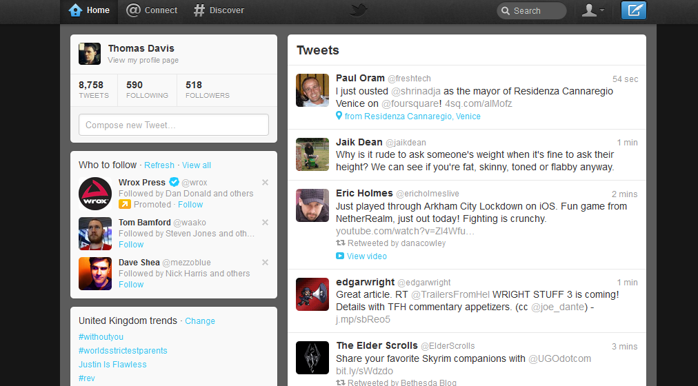
The new design removes this inconsistency and brings the two experiences together through the newly defined areas: home, connect & discover.
The new web layout has switched the positioning of the 2 columns of old (new) twitter with tweets now displayed on the righthand side. I think this is a smart move by twitter, previously I payed little to no attention to the right hand column and yet this is the area twitter places the majority of its promoted content. The new design makes the promoted content & additional data more obvious yet the focal point is still on the tweets which creates a nice balance.

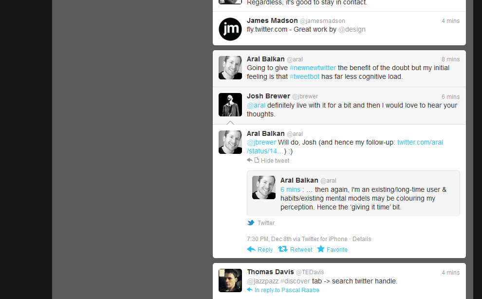
One aspect I particularly like in the new web interface is the expanding of conversations, especially with embedded media:

Update: just trying out an embedded tweet
Some initial ramblings on the #newnewtwitter design designedbythomas.co.uk/blog/new-twitt…
— Thomas Davis (@TEDavis) December9, 2011
I’m still exploring the new look on the iPhone, web and even the new version of tweetdeck too, but so far I’m liking the design changes overall. There are a few aspects which will take a bit of getting used to and I’m sure we’ll see some refinements as twitter takes in the feedback, they’re usually pretty good at listening to their users.
What do you think of the new twitter design? Any aspects you love/hate? Let me know in the comments!
Filed under:
