Introducing: Block - a simple tumblr theme
Today I submitted my first Tumblr theme: ‘Block’ for review. (I named it ‘block’ because the main navigation is quite block-like as is the general structure of the overall theme.)
The theme has now been accepted into the theme garden - and should be available to install here
The theme is currently still awaiting moderation to appear in the general tumblr ‘theme garden’, but I think you should be able to take it for a spin.
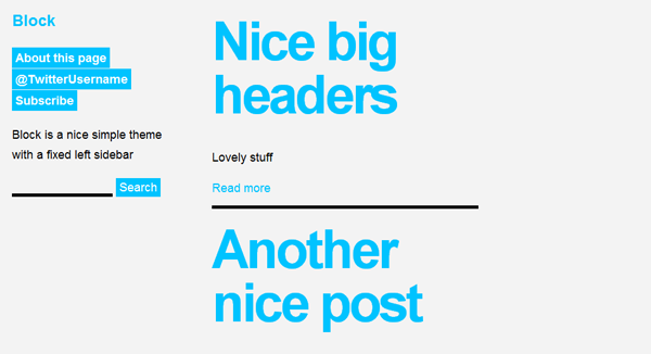
Block is pretty minimalist in style and consists of a fixed sidebar containing the title, any navigation links, description and the search bar (if the user chooses to have it enabled). The main content is to the right of the fixed sidebar with a limited width of 400px and really large headings and pretty big body text too - I quite like this ‘oversized’ style and feel it works quite well, drawing focus to the title posts.

If you do try it out then I’d really like to get some feedback either via the comments or perhaps send me a tweet as this is my first foray into the world of Tumblr themes and an area I’m keen to explore. Block is very much a work in progress theme and I’m using it as a little side project to explore the world of Tumblr a little more.
As a platform, I’ve found Tumblr is really quite nice to develop for, the theme structure is relatively straightforward once you get the hang of it and they have a great documentation section too.
Try the ‘block’ theme & let me know what you think!
Filed under:
