My new website design
This post talks about the latest iteration of my site design and the steps I took in order to produce it. It’s not really about the code I used to create the theme but more the rationale behind the various decisions made, the thoughts running through my head and some general issues I had with my old design.
The main points will be covered as follows:
Colour
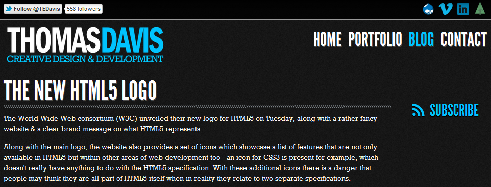
First of all, if you have ever visited my site before then hopefully you will notice quite a big change in the colour scheme, for those of you who have never been here before: the background is now off-white rather than off-black.
This decision was actually quite a hard one to make, for the past few years the colour scheme of my site has remained constant, it had become familiar to a few people and even managed to get me some blog coverage too.
Ultimately, the reason for the switch came down to readability, quite a few people have come back to me saying they didn’t like reading white text on a black background and I have found myself agreeing with them.
In the previous site design I actually implemented a colour switch to allow people to invert how the colours of the blog, I thought about extending this to the entire site but opted for one shared experience over two inverse designs.
Layout
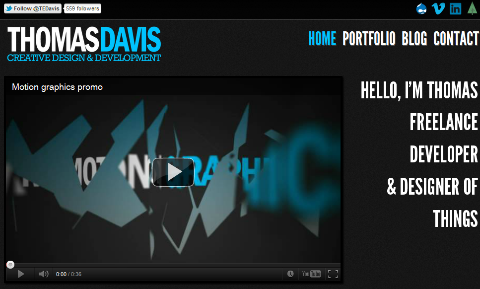
The next key difference is the layout of the site and as with everything in this redesign: it’s all about focus.
In the previous design I had a top bar with external links followed by the logo and navigation then content as follows:
This layout meant that; if a user were coming to my site to read a blog post, the first few things they see are not the blog post, but links taking you elsewhere.
With the updated layout; the logo, navigation and extra links have all been shifted to the less obvious left hand column where they are still visible, however: the new positioning allows for the main content area to be shifted up and as it’s still in the central part of your browser (providing you’re not on a smaller screen device) it becomes the main focal point of the page.
Pages
I am a great fan of website analytics: visitor numbers, entrance sources and most importantly looking at how people navigate through my site. One of my favourite features of Google Analytics is the in-page analytics, this feature gives you an overlay of the click percentages next to each link on the page.
Looking at the in-page analytics from the past year I found a that a large majority of people visiting the homepage didn’t really explore below the fold and simply clicked straight through to my portfolio.
After looking at the in-page analytics data I took a step back to examine the homepage and asked myself: ‘what does this add to the site?’ - On the one hand the homepage has an overview of all the different site sections: featured blog posts and portfolio items and yet the analytics showed that very few people were navigating below the introductory video.
As a result of all this I decided that the old homepage wasn’t adding much to the overall site and chose to make my portfolio the homepage, not only does this remove the additional step users were taking from the homepage to the portfolio but also helps increase the focus on displaying my work.
Consistency
In the past I have sometimes ended up with a few inconsistencies across my site; the structure and markup hierarchy of pages for example has sometimes been a bit off, a prime example of which was the old blog landing page.
On the old blog landing page, there was no title above the list of blog posts the page just listed the various posts. The main problem this presented was that each of the blog titles was a h2 tag styled to use Rockwell as the typeface, all fine until you actually clicked through to read the full post where the title is now an h1 styled up to use League Gothic. This drastic change in type always felt disjointed and it’s something which really began to bug me!
With the new design I’ve opted to use one font (Georgia) across all aspects of the site (apart from my name in the top left), I think it’s both strong and clear enough to be used as both heading and body text and provides some much needed consistency.
The consistency doesn’t just come from the typography used but also how the type is set & spaced on the page too. I read a great article on aligning type and headings etc over on A List Apart - I’d really recommend giving it a read, it certainly pointed me in the right direction when it comes to aligning various elements on your site.
3rd party widgets
This part of the new design is a bit of an experiment: I have removed all the third party buttons and widgets from the site structure. At the end of this blog post you should see a column titled ‘Share this post’ - traditionally I would have placed all manner of third party buttons in this section: the official tweet button, Facebook Like, +1 etc.
These widgets make it very easy to share content straight to the various social networks but they’re also pretty heavy too: when a page loads they make a bunch of requests for external files in order to function, javascript and styling etc. All of which adds up and overall: slows the page down.
I have therefore decided to replace the 3rd party widgets with a simple link to the share boxes of twitter, Facebook and Google+ which is really all you need, especially if you’re visiting my site via a mobile connection with a data usage plan!
This may seem like a trivial point to some but personally I find it infuriating when I visit a blog and I have to wait whilst all these little buttons gradually pop into place, even more so when the buttons are placed in another container which uses yet more javascript to follow me down the page! It’s distracting. If I really want to share an article then I will make the effort to share it!
Along with the share buttons I’ve also removed the ‘twitter ticker’ (try saying that three times and fast) showing my latest tweets, again it just didn’t add much to the site apart from showing that I’m active on twitter. I also noticed that it showed the replies I make to other people on twitter rather than tweets I broadcast to everyone which quite often puts tweets out of context.
And that’s pretty much it!
I do hope you like the new look! I still think there are areas for improvement but overall I’m pretty happy with my progress.
The whole process has been quite a challenge, especially when it comes to reducing the site to only what is really needed, fighting the urge to add in elements which I think ultimately wouldn’t really add anything to the overall site.
I think that’s the key point I’ve taken away from this design, throughout a design I think you should always stop and ask yourself: ‘why is that there?’ or ‘what purpose does that have?’ - if you can’t think of a good enough reason then chances are it doesn’t need to be there!
Filed under: